Winstep

Software Technologies


 Winstep Forums


Print view
Board index : Winstep Forums : General Discussion  [ 147 posts ] Go to page Previous  1 ... 6, 7, 8, 9, 10  Next
Author Message
 Post subject: Re: So, what's next after v25.9 ?
PostPosted: Tue Dec 09, 2025 8:35 am 
Offline
Site Admin
Site Admin
User avatar

Joined: Thu Feb 26, 2004 8:30 pm
Posts: 12728
Actually it is going to be pretty much the last image (the one ChatGPT came up with). Already working on it.

I also want to do a closed beta possibly later today, BEFORE I start adding stuff for the desktop module in ernest as I don't know how long that will take, so we can test the actual operation of the drive meter (that part is supposed to be complete) and how it handles other drives in the wild, etc...

TECHLOBO, we need you too!!!! Moonbase alpha to Techlobo, please come in! :P

_________________
Jorge Coelho
Winstep Xtreme - Xtreme Power!
http://www.winstep.net - Winstep Software Technologies


Back to top
 Profile WWW 
 
 Post subject: Re: So, what's next after v25.9 ?
PostPosted: Tue Dec 09, 2025 9:18 pm 
Offline
Site Admin
Site Admin
User avatar

Joined: Thu Feb 26, 2004 8:30 pm
Posts: 12728
Betas of v25.12 are out:

Winstep Xtreme beta:
https://www.winstep.net/xtreme-beta.zip

Nexus Ultimate beta:
https://www.winstep.net/ultimate-beta.zip


This is a beta and MUST be installed ON TOP of a full v25.9 OR LATER installation. Do NOT uninstall anything first, just exit all running Winstep applications and run the beta setup file.

There is no need to backup your settings first, but it does not hurt if you do either.

####

So, this features the new Disk Meter module. For now there is no proper desktop version of the module, you can open it but currently it will only show and monitor drive C:\ with no way to change that. Once I am finished with it, it will have a nice look and will be able to monitor multiple drives at the same time.

So, to use the iconic version of the module, simply right click the dock, shelf, or whatever, select Insert New Item -> Module -> Disk Meter. By default it will show Drive C: but you can change that by right clicking the module icon, going to the Item Properties window and changing the Argument to whatever drive you want to monitor.

ONLY existing FIXED DISK drives will be listed!

I'm probably going to allow selecting the drive immediately when adding a Disk Meter module to the dock, and also adding a "Drive to Monitor" option to the right click context menu of the Disk Meter module, so you can change the drive a particular iconic disk meter module is monitoring without having to open the Item Properties dialog.

Right clicking the module (or in Preferences -> Modules tab) allows you to get to the Disk Meter Settings panel. Currently it is mostly empty as I still have to add the options related to the Desktop Meter version of the module.

Most importantly, it is FULLY functional for the iconic version of the module - and you can already customize the colors etc In fact, if you guys come up with some really nice color variations (for both the Drive and Ring Chart styles) please post screenshots of the dialog with the Hue, Sat, Lum, etc, settings ( and what the variation looks like) here. If I like the result, I will add them as Presets.

Another important feature is the Drive Information dialog. It will basically give you all the drive info the module collects, and you can see all available drives in it even if you did not add them to a dock, etc...

So, please let me know how the module behaves with your drives etc... please remember that some drives have proprietary SMART protocols and therefore the module might not be able to show temperature and Life Remaining (if SSD) for all drives, etc...

Also, check for any performance issues and report back if you experience any. There shouldn't be unless hardware/drivers misbehave as I otherwise optimized the code to hell.

SMART data is retrieved via the Winstep Service in an async way. If a drive or chipset chokes on it, the main application should not be affected. Even if a drive blocks completely and never returns from a SMART read operation, the service should recover in about 10 minutes (ignoring the misbehaving drive from then on).

Either way, have fun. Full changes list can be obtained after installing the beta from Preferences -> About tab -> click the Version Number at the top right -> View Change Log.

Above all, have fun playing with the new module!

_________________
Jorge Coelho
Winstep Xtreme - Xtreme Power!
http://www.winstep.net - Winstep Software Technologies


Back to top
 Profile WWW 
 
 Post subject: Re: So, what's next after v25.9 ?
PostPosted: Wed Dec 10, 2025 12:38 am 
Offline
Site Admin
Site Admin
User avatar

Joined: Thu Feb 26, 2004 8:30 pm
Posts: 12728
Guys, regarding allowing info both on top AND bottom of the disk meter icon:

The pros of this is that you would:

a) More lengthy info like Capacity or Bytes Read/s could become more readable by, for instance, displaying Bytes Read/s at the top of the icon and Bytes Written/s at the bottom, instead of "Bytes read/Bytes Written" at the bottom.

b) You could actually display four different types of info at once, two at the top, two at the bottom.

c) It is a user choice. The user may still choose not to display anything at the top of the icon (which is the default) OR he may choose not to display anything at the bottom and instead at the top.

Cons:

a) If the user chooses to display info on the top of the icon, legibility of the icon itself suffers a bit, of course.

This said, the default disk meter images were designed in such a way that they are shifted up instead of being centered in the icon, that is, there is a bit of empty space at the bottom of the icon to fit the text.

if the user decides to display info at the top of the icon, I automatically shift the image down a bit so that the empty space at the bottom is divided evenly between empty space at the top and the bottom. The text at the top and bottom is still going to overlap a bit of the meter image, of course, but shifting the image helps minimize how much of it is actually overlapped.

Likewise, if the user chooses to only display info at the top and none at the bottom, I can shift the icon all the way down in such a way that all the empty space is now at the top. Something else I do if there is text at the top for the Drive style icon is to move the drive letter etched onto the drive case a bit down so it does not get overlapped by the top info.

Anyway, describing something is one thing, actually seeing it is another, so I temporarily changed the code to see what allowing info at the top as well as the bottom would look like. Have a look and please give me your opinion ASAP. Again, remember this would be user choice, if he wants to make the icon unreadable, it is up to him (but I still don't think that is the case, I think it is actually not that bad, which is why I am fishing for opinions here).

Attachment:
Screenshot 2025-12-10 001515.png
Screenshot 2025-12-10 001515.png [ 53.26 KiB | Viewed 166 times ]

Attachment:
Screenshot 2025-12-10 002012.png
Screenshot 2025-12-10 002012.png [ 45.4 KiB | Viewed 166 times ]

Attachment:
Screenshot 2025-12-10 002030.png
Screenshot 2025-12-10 002030.png [ 112.81 KiB | Viewed 166 times ]

_________________
Jorge Coelho
Winstep Xtreme - Xtreme Power!
http://www.winstep.net - Winstep Software Technologies


Back to top
 Profile WWW 
 
 Post subject: Re: So, what's next after v25.9 ?
PostPosted: Wed Dec 10, 2025 3:43 am 
Offline
User avatar

Joined: Thu Sep 08, 2016 10:10 pm
Posts: 364
In lunch break...saw this, installed and tested. It works well. I found only one error and it might be me. So I posted. The left click does zero on desktop module as anticipated. Yes skinning will be good when an *.ini file is available to create more space between the graphic and the text. Your colouration for these may be the most comprehensive working choices so far.. well done. They completely change the hues. I noticed that hues previously were closer to tinting rather than hues. These are definitely hues. well done.
Attachment:
new drive module 1.jpg
new drive module 1.jpg [ 27.69 KiB | Viewed 154 times ]


The Nexus Ultimate on another computer also does well except for one thing which is the last image.
Attachment:
Nexus Uklt 1.jpg
Nexus Uklt 1.jpg [ 33.07 KiB | Viewed 154 times ]


On left double clicking the Drive icon above in the prior image in Nexus Ultimate, it cannot find a path. As I mentioned, that's probably me and I likely was not supposed to do that.
Attachment:
left click error.jpg
left click error.jpg [ 17.86 KiB | Viewed 154 times ]


Back to top
 Profile  
 
 Post subject: Re: So, what's next after v25.9 ?
PostPosted: Wed Dec 10, 2025 3:58 am 
Offline
User avatar

Joined: Thu Sep 08, 2016 10:10 pm
Posts: 364
Back to work. One other thing I noticed.

I changed the hues on two themes only on desktop module.
When I revert to previous ones, it is not saving the hue changes I did. I guess that is by design so far? No big deal. early days :)


Back to top
 Profile  
 
 Post subject: Re: So, what's next after v25.9 ?
PostPosted: Wed Dec 10, 2025 4:11 am 
Offline
Site Admin
Site Admin
User avatar

Joined: Thu Feb 26, 2004 8:30 pm
Posts: 12728
BassdudeNZ wrote:
On left double clicking the Drive icon above in the prior image in Nexus Ultimate, it cannot find a path.


Thanks! Figured out what is causing it. Here is how to fix it: right click the drive icon, select "Dock entry properties", then immediately press OK in the Item Properties dialog.

BassdudeNZ wrote:
I changed the hues on two themes only on desktop module.
When I revert to previous ones, it is not saving the hue changes I did.


Huh? Not sure I follow?

_________________
Jorge Coelho
Winstep Xtreme - Xtreme Power!
http://www.winstep.net - Winstep Software Technologies


Back to top
 Profile WWW 
 
 Post subject: Re: So, what's next after v25.9 ?
PostPosted: Wed Dec 10, 2025 5:09 am 
Offline
User avatar

Joined: Thu Sep 08, 2016 10:10 pm
Posts: 364
winstep wrote:

Huh? Not sure I follow?


Ok as you can see I changed the colors to match the Modern Office Theme
and the newer Recording studio (below)

Attachment:
disk hue change.jpg
disk hue change.jpg [ 8.11 KiB | Viewed 148 times ]


When I either refresh the theme or load a new theme, it does not save the hue changes (image below). Sorry, have to go... Be back later. :)
Attachment:
theme chage-click.jpg
theme chage-click.jpg [ 5.06 KiB | Viewed 148 times ]


Back to top
 Profile  
 
 Post subject: Re: So, what's next after v25.9 ?
PostPosted: Wed Dec 10, 2025 6:12 am 
Offline
Site Admin
Site Admin
User avatar

Joined: Thu Feb 26, 2004 8:30 pm
Posts: 12728
BassdudeNZ wrote:
When I either refresh the theme or load a new theme, it does not save the hue changes (image below).


You mean it does not KEEP/RETAIN the Hue changes when you switch to another theme, right?

###

In the mean time, when adding a disk meter module to a dock or shelf you can now immediately choose which drive that module monitors, as clicking "Disk Meter" in the context menu opens a sub-menu displaying all available drives. You simply select the one you wish to monitor and voila, Bob's your uncle (this also fixes the problem of the missing drive letter when left clicking on the module)!

Also added a "When selecting drives always show all drive letters" setting to the Disk Meter Preferences dialog. This allow users to add disk meter modules that monitor drives that are currently off-line.

Also going with the option to optionally display up to 4 pieces of info on the icon, despite the absence of feedback on that. It is a user choice, after all, and by default info is only displayed in the bottom part of the icon.

_________________
Jorge Coelho
Winstep Xtreme - Xtreme Power!
http://www.winstep.net - Winstep Software Technologies


Back to top
 Profile WWW 
 
 Post subject: Re: So, what's next after v25.9 ?
PostPosted: Wed Dec 10, 2025 11:34 am 
Offline
User avatar

Joined: Thu Sep 08, 2016 10:10 pm
Posts: 364
winstep wrote:
BassdudeNZ wrote:
When I either refresh the theme or load a new theme, it does not save the hue changes (image below).


You mean it does not KEEP/RETAIN the Hue changes when you switch to another theme, right?

Also going with the option to optionally display up to 4 pieces of info on the icon, despite the absence of feedback on that.

#

correct - It is no big deal, I figured you cannot do everything at once and will get around to it. :)

As for #2 with display, I think six would be better. Now you have feedback, albeit tardy.


Back to top
 Profile  
 
 Post subject: Re: So, what's next after v25.9 ?
PostPosted: Wed Dec 10, 2025 6:58 pm 
Offline

Joined: Mon Sep 19, 2022 6:08 pm
Posts: 83
I really like the Disk Meter Module. The Drive and Ring Chart versions both look good. I feel that the Ring Chart recolors better than the Drive.

I would like to see an option to change the font for the data below the drive. I am using it on a 24" HD monitor and I have to make it larger than I would like to easily read the data. I also think showing data on the top and bottom would look too cluttered.

Two of my four drives could not show the Lifetime Remaining, but that is an option I would not use anyway. They were a Western Digital mechanical drive and a Crucial SSD. The two drives that worked were a Samsung SSD and a Corsair NVMe. All the other settings worked just fine on all drives.

After playing around will all the settings for a while, I noticed I no longer had a click sound for items in the dock. It returned after a reboot.

For the Disk Meter Desktop Module I like the iFlip Calendar slightly better than the iStat. It would depend on what theme I was using though. Having both to choose from would be nice. A light and dark version would also be nice. My eyes are too old to look at small text, so the more readable the better.


Back to top
 Profile  
 
 Post subject: Re: So, what's next after v25.9 ?
PostPosted: Thu Dec 11, 2025 8:44 am 
Offline
User avatar

Joined: Wed Aug 04, 2021 8:39 am
Posts: 137
winstep wrote:
TECHLOBO, we need you too!!!! Moonbase alpha to Techlobo, please come in! :P

OK, I'm checking in.

Just had a bit of time playing with the ‘ring’ representation.

Comments (and questions) as they come:

1) When you first open the v25.12 beta zip file, the Readme.txt file specifies it as 25.11 update

2) When module first opened and select customize under the ring display the following behaviours are observed:
    a) Select 'New Preset' in Presets: drop down - nothing happens and the selections reverts to Default.
  1. If I select one of the ‘Colorize’ options (which I’m not sure what they are meant to represent – maybe some popup / help might be useful here) then a set of Presets(?) are applied and the Presets: selection is set to ‘New Preset’. If I then choose 'Default' the values revert, but on selecting ‘New Preset’ it goes back to the last set of ‘Presets’ that were in operation with the Colorize option selected.
  2. Unticking the Colorize selections reverts back to the Default preset option, but if New Preset is then selected it reverts back to the previous selection with one of the Colorize options selected.
  3. If I cancel out of the whole dialog then start again then this doesn’t happen until Colorize is selected again.
  4. I do note that if I select the Colorize option the Hue and Saturation slider metrics are changed from -180 to 180 (and -100 to 100) to 0 to 360 (and 0 to 100), whereas the Lightness slider remains the same. I assume that this relates to my current lack of understanding of what colorize means, and hence why one changes to the full range (360) while the other only changes to 100.

    b) Using the sliders enable the colours and brightness to be adjusted, with values being shown in the associated boxes (where they can also be adjusted). 
    c) Modifying a slider / value immediately changes displayed option in Presets: to New Preset
    d) If I change a couple of values then return them to zero the Presets: reverts to Default - but if I then select New Preset the last value that was returned to zero reverts back to its previous value (probably related to actions observed in a) above). Is this supposed to happen?

    Note - I can also delete the values within the boxes (leaving everything blank) although sliders don’t change. If I save as a preset the values return. Not wrong, just strange.

    e) If I then save the Preset to 'My Save 1' say, it gets added to the drop-down list and I can select any of the options. 
    f) However, if I make a change and then save again with the same name, I get a dialog box stating that 'A preset with this name already exists. Do you want to overwrite it?'. If I select Yes, the item is repeated in the drop-down list, not overwritten.
    g) I also note that the Presets are just presented in the order saved, not alphabetically which I suspect would make it easier to find if you have a few. Although I appreciate that you would need to retain the ‘system presets’ at the top.
    1. I did try saving as the system presets and was stopped from doing so. 

    h) I did try adding numerous Presets and the drop-down did eventually turn to a scroll list 
    i) Am unable to type in Preset: box to select a preset – only option is drop-down selection.
    j) Placing same values into boxes as a previously saved preset did then present that preset in the Presets: drop-down box. 
    k) Am unable to edit a previously saved preset. Only option presented is delete. I can start to change the values but then the Presets: option reverts to ‘New Preset’ so I have to remember the name of the preset I was working with and then enter it / save again – which then gives duplicate as mentioned above.

3) Selecting ‘Save as PNG’ allows me to select a location / name for the graphic to be stored. However, if make change and then choose same location / name I get dialog boxes to state that it already exists and do I want to replace it, then on selecting Yes another dialog box (this time from Workshelf) saying it already exists. Overwrite? – on selecting Yes again the dialog box shuts, but on checking graphic it hasn’t changed. Two issues – one we shouldn’t have 2x dialogs for same thing, and two the graphic needs to be replaced.

4) If I choose to display certain metrics the text size varies when displayed on the desktop widget. The smaller size is better as it sits below the Icon (e.g. Free Space and total capacity). Whereas if I choose say Temperature and %age used the text is larger and overlaps the icon. Is it not possible to just keep the smaller text for all options?
  1. Same happens if only choose one item to display (e.g. set other to None). Personally, I would prefer the smaller text always.
  2. If I choose to make Primary and Secondary metric the same then only one value is presented. 
  3. Question – would it be possible to get the text to display in the same colour as the selected metric i.e. to act as a visual key?
  4. At the moment if I choose say Free Space and Percent Used then I get the two values but as Nexter mentioned previously the user could be confused as to whether the %age value refers to the capacity shown.

5) Drive activity and disabling smart queries appears to work correctly, although it would be useful to be able to modify the brightness of the activity display (and possibly the size in the case of the ring / circle representation) – as it is not necessarily obvious.

OBSERVATION - making detailed responses in this bulletin board is a pain, as I keep having to restructure the response and its not particularly easy to highlight different aspects.

Ideally there should be another mechanism for providing test feedback if its not just a simple result!

If I get time I may look at the other drive representation later.


Back to top
 Profile  
 
 Post subject: Re: So, what's next after v25.9 ?
PostPosted: Thu Dec 11, 2025 10:06 am 
Offline
User avatar

Joined: Wed Aug 04, 2021 8:39 am
Posts: 137
As I've mentioned previously I really only use Workshelf for application organisation (decluttering desktop) and NextStart taskbar (primarily to see which applications are open, and which is active).

[Text removed as I've just read Jorges message properly!]

Note. If I have multiple drive modules in a dock / shelf, right click and select 'View Drive Information' - then the dialog box shown defaults to C: regardless of which drive module I right-clicked on. I realise that I can then select the relevant drive, but would prefer that it default to the drive that was right-clicked on if possible.

Final note (for now). If I right click on a drive module in a dock / shelf and choose Entry Properties->Change Icon then the drop-down presented only provides the option for 'Drive' even if the module being displayed currently is a ring!


Back to top
 Profile  
 
 Post subject: Re: So, what's next after v25.9 ?
PostPosted: Thu Dec 11, 2025 11:23 am 
Offline
User avatar

Joined: Wed Aug 04, 2021 8:39 am
Posts: 137
winstep wrote:
Also going with the option to optionally display up to 4 pieces of info on the icon, despite the absence of feedback on that. It is a user choice, after all, and by default info is only displayed in the bottom part of the icon.


Not sure what you are saying here Jorge - I get that the default is only to display (upto 2 pieces of) info at bottom of icon, but is there meant to be an option to display upto 4 items (2 top, 2 bottom)? If so I can't see it.


Back to top
 Profile  
 
 Post subject: Re: So, what's next after v25.9 ?
PostPosted: Thu Dec 11, 2025 10:28 pm 
Offline
Site Admin
Site Admin
User avatar

Joined: Thu Feb 26, 2004 8:30 pm
Posts: 12728
Nezbit wrote:
I would like to see an option to change the font for the data below the drive. I am using it on a 24" HD monitor and I have to make it larger than I would like to easily read the data. I also think showing data on the top and bottom would look too cluttered.


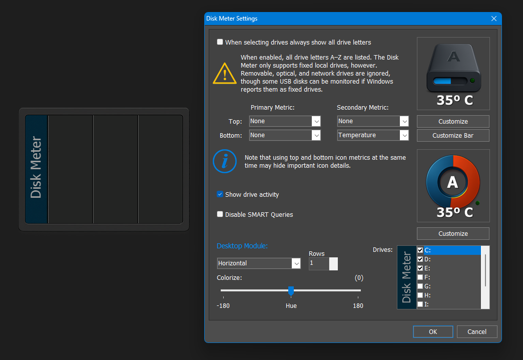
Changing the font would not help, that is already as readable as it can be. As for data on top and bottom, it does look cluttered, but it is really up to the user. By default data is only shown at the bottom of the icon.

Nezbit wrote:
Two of my four drives could not show the Lifetime Remaining, but that is an option I would not use anyway. They were a Western Digital mechanical drive and a Crucial SSD.


Thanks! Mechanical drives (HDDs) do not have "Lifetime Remaining", that is only for SSDs. As for the Crucial, some drives either do not expose some data (I have a T-Force SATA SSD that does not report temperature, they did it deliberately) or they do it in a proprietary way that the disk meter module cannot read (supporting proprietary protocols is completely beyond the scope of this module).

Nezbit wrote:
For the Disk Meter Desktop Module I like the iFlip Calendar slightly better than the iStat. It would depend on what theme I was using though. Having both to choose from would be nice. A light and dark version would also be nice. My eyes are too old to look at small text, so the more readable the better.


Actually it's going to be neither... well, more like the iFlip. Still working on it, but here is what it will look like with room for 3 drives:

Attachment:
Screenshot 2025-12-11 183519.png
Screenshot 2025-12-11 183519.png [ 120.61 KiB | Viewed 37 times ]

techlobo wrote:
When you first open the v25.12 beta zip file, the Readme.txt file specifies it as 25.11 update


You really dig into the details, I like that. :D I noticed afterwards, but since it was not a big deal and I had already uploaded the file I did not bother to fix it.

techlobo wrote:
a) Select 'New Preset' in Presets: drop down - nothing happens and the selections reverts to Default.


Ok, I understand it can be a bit confusing at first, but here is how it works:

"New Preset" is anything combination of color settings (Hue, Sat, Lum, Colorize) that is not part of existing Presets. So, whenever you make a change to the existing preset combinations, the combo box changes to "New Preset".

The somewhat confusing part is that you can also select "New Preset" in the combo box. However, if you did not make any changes to the existing settings and those match an existing preset, the existing preset is automatically selected instead.

"New Preset" is also what allows you to know at a glance that the current combination of settings (Hue + Sat + Lum + Colorize) are not saved anywhere and do not match any of the existing presets. You can then save that combination of settings into a new preset by clicking the Save button and naming the new preset.

techlobo wrote:
which I’m not sure what they are meant to represent


Anyone a bit familiar with Photoshop will recognize those settings as they are exactly the same. Those who do not, can simply play with them - there is no room in that dialog (or even on a tooltip) to explain color theory.

techlobo wrote:
I assume that this relates to my current lack of understanding of what colorize means, and hence why one changes to the full range (360) while the other only changes to 100.


Yes... Colorize overlays a "tint" color over a bitmap (that color is defined by the 360º color wheel represented by Hue, it's "intensity" by Saturation and how bright it is by Luminance). When Colorize is not selected, however, a different formula is applied and instead of an absolute color applied to the whole bitmap, ALL the different colors in that bitmap are shifted in Hue by the amount you define with the Hue slider - which is why it now goes from -180 to +180 instead of 0 - 360).

techlobo wrote:
Is this supposed to happen?


Yes. If you make some changes, do not save them as a preset, then go back to that dialog and select an existing preset, this still gives you a chance to go back to the previous combination of settings that were not saved anywhere.

techlobo wrote:
f) However, if I make a change and then save again with the same name, I get a dialog box stating that 'A preset with this name already exists. Do you want to overwrite it?'. If I select Yes, the [b]item is repeated in the drop-down list, not overwritten


Fixed, thanks! :D

techlobo wrote:
g) I also note that the Presets are just presented in the order saved, not alphabetically which I suspect would make it easier to find if you have a few. Although I appreciate that you would need to retain the ‘system presets’ at the top.


Yep, system presets need to be at the top... in fact, there should be a fake entry saying "--user presets--" separating the two sections.

Also, not sure about being easier to find if stored alphabetically, I suspect there won't be many plus like this they are in chronological order.

techlobo wrote:
i) Am unable to type in Preset: box to select a preset – only option is drop-down selection.
k) Am unable to edit a previously saved preset.


Yes, these are the drawbacks of using a single combo to handle both new and existing presets. But it was required, space is tight.

techlobo wrote:
choose same location / name I get dialog boxes to state that it already exists and do I want to replace it, then on selecting Yes another dialog box (this time from Workshelf) saying it already exists.


Completely forgot the Windows Browse dialog already did a "file already exists with the same name" check for me. Fixed. Also, now I give the default png filename the same name that is on the Presets box (the file is actually being replaced, I checked, and an error dialog now pops up if the application cannot overwrite the file for whatever reason).

techlobo wrote:
Is it not possible to just keep the smaller text for all options?


It is, but then it is even more difficult to read the text at smaller icon sizes (and the current size is the same as that used in all the other modules, e.g. weather, CPU meter, etc. At these sizes it is basically impossible not to overlap a bit of the icon image). You want smaller text, Nezbit wants larger text.

techlobo wrote:
Question[/u] – would it be possible to get the text to display in the same colour as the selected metric i.e. to act as a visual key?


Not really. I think since it is the user who chooses which information goes where, he will know (should know?) what each value refers to.

techlobo wrote:
it would be useful to be able to modify the brightness of the activity display (and possibly the size in the case of the ring / circle representation) – as it is not necessarily obvious.


Actually the led has 3 levels of brightness, depending on how much data is being written/read. But I agree that the lowest level of brightness needs to be more bright.

Anyway, thanks for the detailed observations and the time you spent writing them.

_________________
Jorge Coelho
Winstep Xtreme - Xtreme Power!
http://www.winstep.net - Winstep Software Technologies


Back to top
 Profile WWW 
 
 Post subject: Re: So, what's next after v25.9 ?
PostPosted: Fri Dec 12, 2025 12:50 am 
Offline
Site Admin
Site Admin
User avatar

Joined: Thu Feb 26, 2004 8:30 pm
Posts: 12728
techlobo wrote:
If I have multiple drive modules in a dock / shelf, right click and select 'View Drive Information' - then the dialog box shown defaults to C: regardless of which drive module I right-clicked on. I realise that I can then select the relevant drive, but would prefer that it default to the drive that was right-clicked on if possible.


Yes, I would have done that but that actually means a drastic code change to that part of the context menus to pass info about iconic modules, as until now modules did not monitor different objects, only a single object.

Functionality wise, however, it's almost the same so I am not sure it is worth the trouble. Perhaps change the option to "View DriveS information" in that case.

techlobo wrote:
If I right click on a drive module in a dock / shelf and choose Entry Properties->Change Icon then the drop-down presented only provides the option for 'Drive' even if the module being displayed currently is a ring!


That was kind of deliberate because the ring chart is a "composite" bitmap ("free space" background bitmap overlapped by a "used space" bitmap), and you can only specify a single bitmap on that dialog (the bitmap showing the free space). Having second thoughts on that though, as it might still be useful for colors/shades difficult if not impossible to achieve even with all the colorization options (or slightly changing the shape of the ring). Whatever the user chooses, it must "match" with the "used space" ring though.

techlobo wrote:
I get that the default is only to display (upto 2 pieces of) info at bottom of icon, but is there meant to be an option to display upto 4 items (2 top, 2 bottom)? If so I can't see it.


Added it after the beta.

_________________
Jorge Coelho
Winstep Xtreme - Xtreme Power!
http://www.winstep.net - Winstep Software Technologies


Back to top
 Profile WWW 
 
Post new topic Reply to topic Board index : Winstep Forums : General Discussion  [ 147 posts ] Go to page Previous  1 ... 6, 7, 8, 9, 10  Next
Display posts from previous:  Sort by  

Who is online

Users browsing this forum: Apple [Bot], Majestic-12 [Bot] and 19 guests


You cannot post new topics in this forum
You cannot reply to topics in this forum
You cannot edit your posts in this forum
You cannot delete your posts in this forum
You cannot post attachments in this forum

Search for:
Jump to:  
cron